Concept study · fictional brand
A four-page shop for a dog and cat brand, designed from the logo outwards
4
Pages: home, shop, product and brand story
16
Products in a working catalogue with filters, sizes and a cart
2
Design rounds. The first one was thrown away
The brief
A small brand selling beds, feeders, harnesses and toys for dogs and cats, with free shipping across the US. It has a logo, a cream and gold palette and a short range in four categories. It needs a simple, clean site of three or four pages that feels considered rather than templated.
Tailwick is a fictional brand made for this study. The brief is a common one, so it is a fair test of how we approach a small ecommerce site.
What the first round got wrong
The first version was dark, editorial and heavily animated. Set next to the logo it looked like a different company, and it read like a template. It was scrapped and rebuilt from the logo outwards.
The build
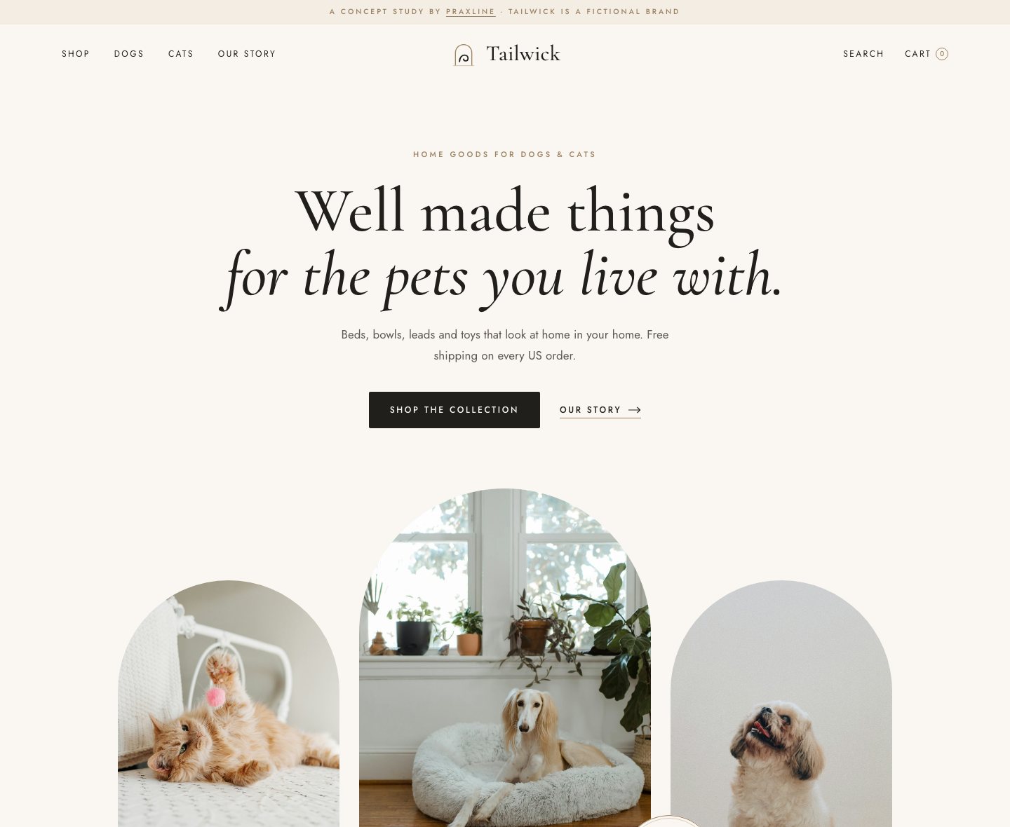
Everything comes from the brand mark. The colours are the logo's cream, ink and gold. Its arch shape frames the photography, and thin gold rings frame the categories. The layout is centred and calm, like the logo lockup, with whitespace doing the work boxes usually do.
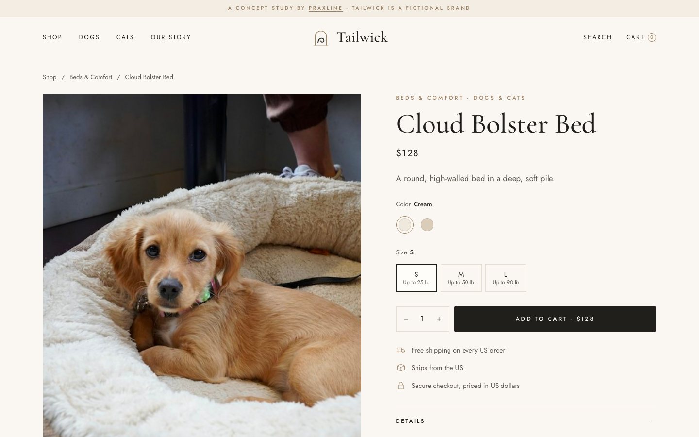
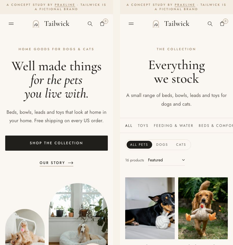
Behind the four pages sits one product catalogue. It drives the shop filters (by category and by pet), sorting, product pages with colours and sizes, search, and a cart drawer that remembers what was added. Motion is gentle and switches off for visitors who ask their device to reduce it. On a phone, product rows swipe sideways and the product page keeps an add-to-cart bar in reach.
For a live shop, the same design would become a Shopify theme, so products, checkout and order tracking run from the store's admin.
Stack
What it shows
- A small brand can carry a whole site when the colours and shapes come from its own logo.
- A short catalogue still needs real shop mechanics: filters, sizes, a cart that remembers.
- Mobile gets its own layout, not the desktop stacked into one column.
- Placeholders are honest. Checkout and sign-up say plainly that they are not connected.
Photography in the demo is from Unsplash, used under the Unsplash License. See photo credits.
More case studies
See all case studiesWant a site like this for your brand?
Start with a 25-minute call: what you sell, who buys it, and what the site needs to do. You get a written scope and a fixed price before any work starts.